Warm Minimalism Without the Beige Blur
A practical guide to building a calm interior with honest materials, useful contrast and enough texture to survive real life.
Written by Vestados Editorial · 2 July 2026
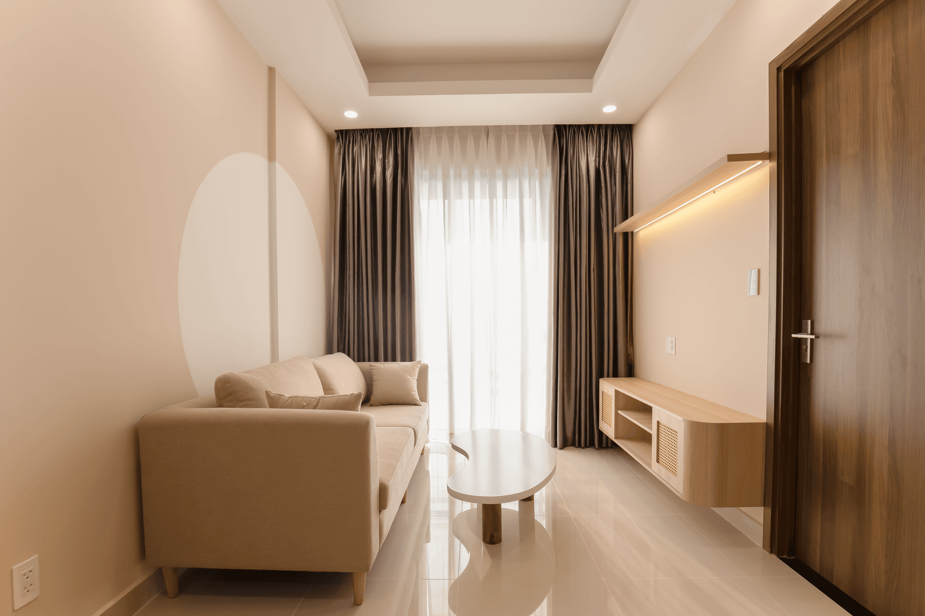
Beige is not a design plan. A room can contain pale oak, cream upholstery and a looped wool rug and still feel flat. Warm minimalism works when every surface has a clear role. One material gives the room structure, another softens sound, and darker notes show where the eye should rest. The useful version also survives ordinary life. Timber can be repaired. Upholstery has a cleaning route. A wall finish can be touched up without repainting the whole floor. Start with the room you have, including its daylight, traffic and storage problems, rather than a saved image with different proportions. The aim is not to own as little as possible. It is to remove the things that interrupt use and give the remaining materials enough space to show what they are.
Give one material the leading role
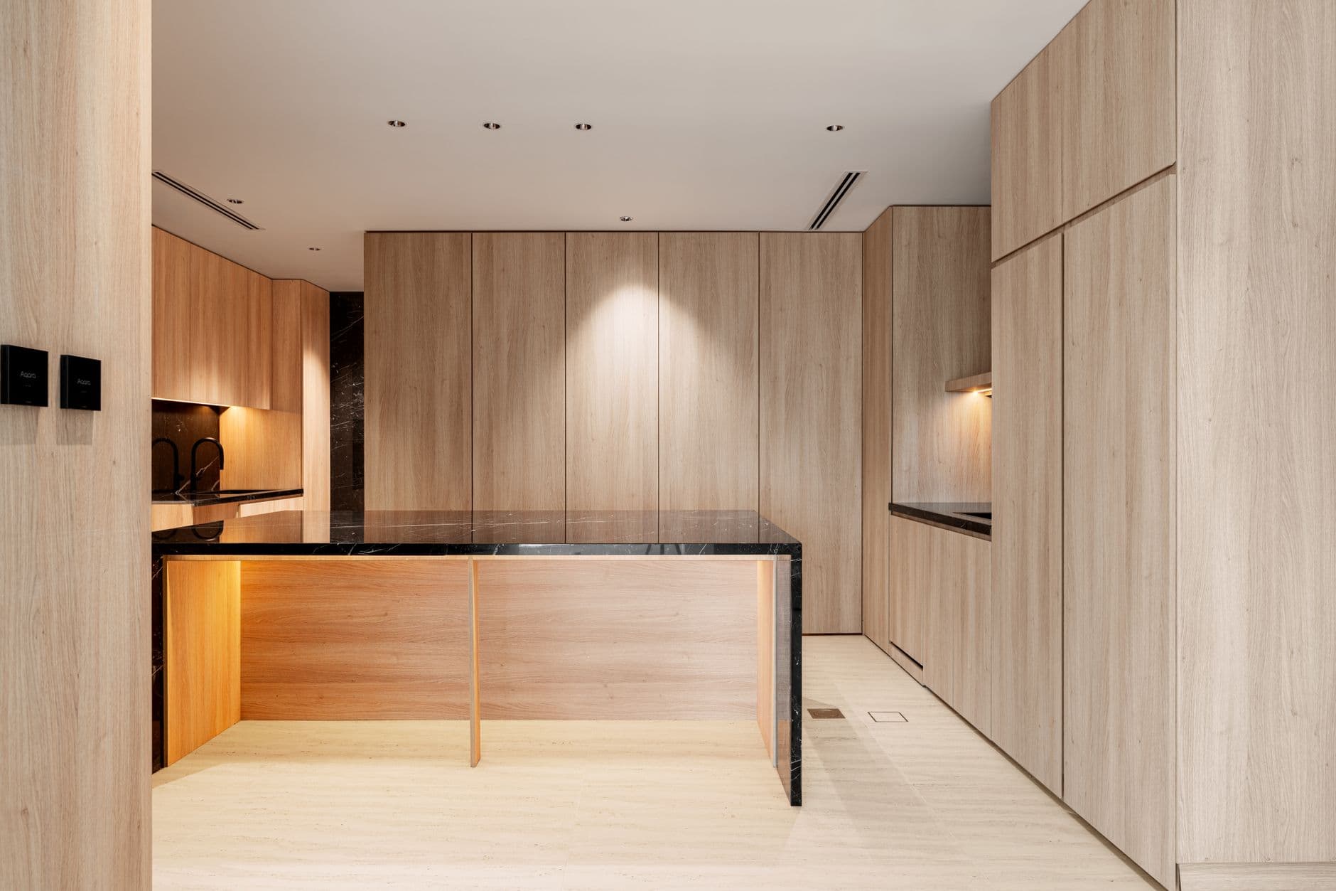
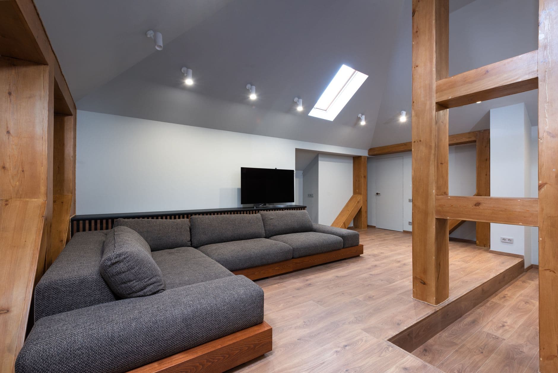
Warm rooms become muddy when every surface competes in a slightly different tan. Choose one material to set the architecture, then let the others support it. Oak cabinetry might provide the grain and rhythm, while a quieter stone handles the worktop and a plain floor holds the composition together. Look at construction before colour. A timber door can be solid wood, veneered board or a printed laminate, and each ages differently at the edge and around a handle. If responsible sourcing matters, check the label on the exact product. FSC 100%, FSC Recycled and FSC Mix describe different routes for the forest based material inside an item. They are not interchangeable style badges. Natural stone needs equally precise questions. Its geological family and composition affect the cleaner and care it needs. Ask for the identity, finish and batch in writing, then keep an offcut. A material feels generous when you understand what it is and allow its grain or variation to continue across a useful area.
Texture needs a cleaning plan
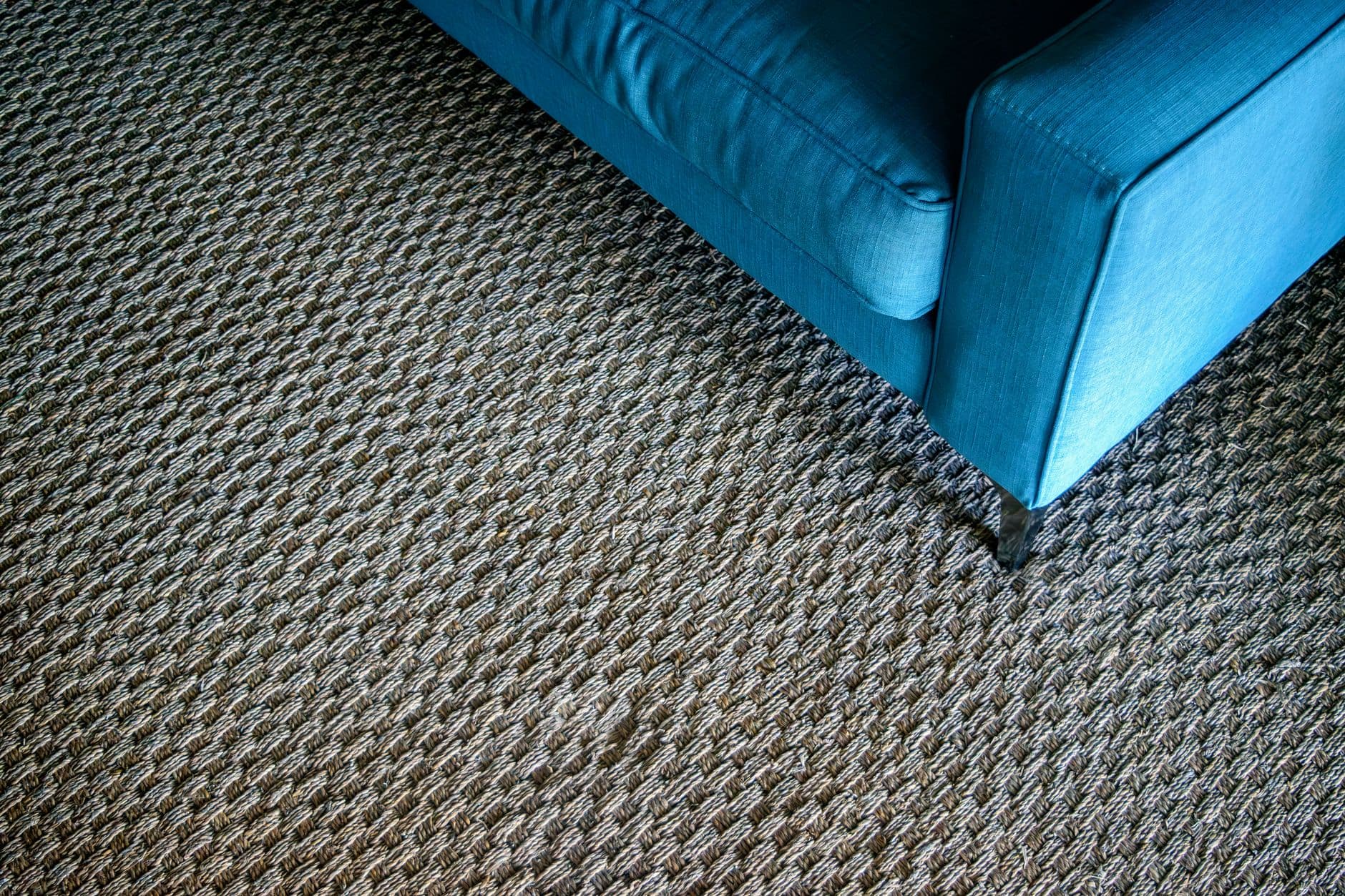
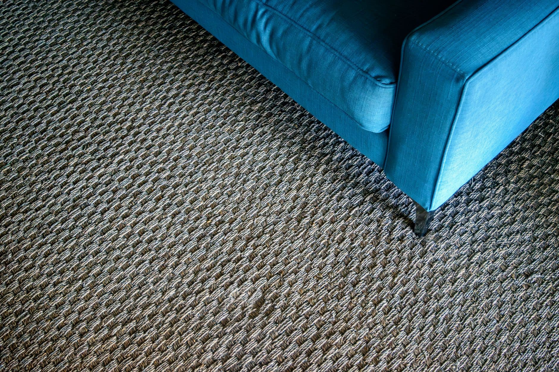
Bouclé, brushed wool and deep pile are persuasive in a photograph because side light exaggerates every loop. Daily use is less flattering. Crumbs lodge in open weaves, dark denim transfers colour, pets pull yarn and dining chairs compress the same path through a rug. None of those facts rules out a tactile fabric. They simply belong in the decision. Ask for fibre content, cleaning instructions and performance data that matches the application. The Association for Contract Textiles separates abrasion, colourfastness and physical properties because one test cannot describe the whole life of a textile. Its guidance also warns against treating an abrasion result alone as a lifespan prediction. At home, request the largest sample available. Fold it around an edge, rub it with a clean white cloth and view it beside the window and under evening lamps. Use the most vulnerable textures where hands and shoes touch them less. A nubby cushion is easier to replace than a full sofa, and a flat woven dining rug is easier to clean than a pale shag under six chairs.
A pale palette still needs an edge
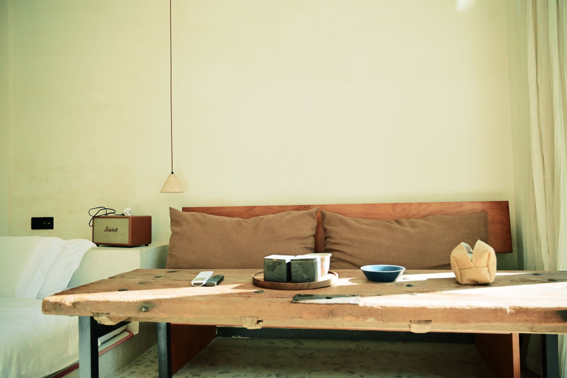
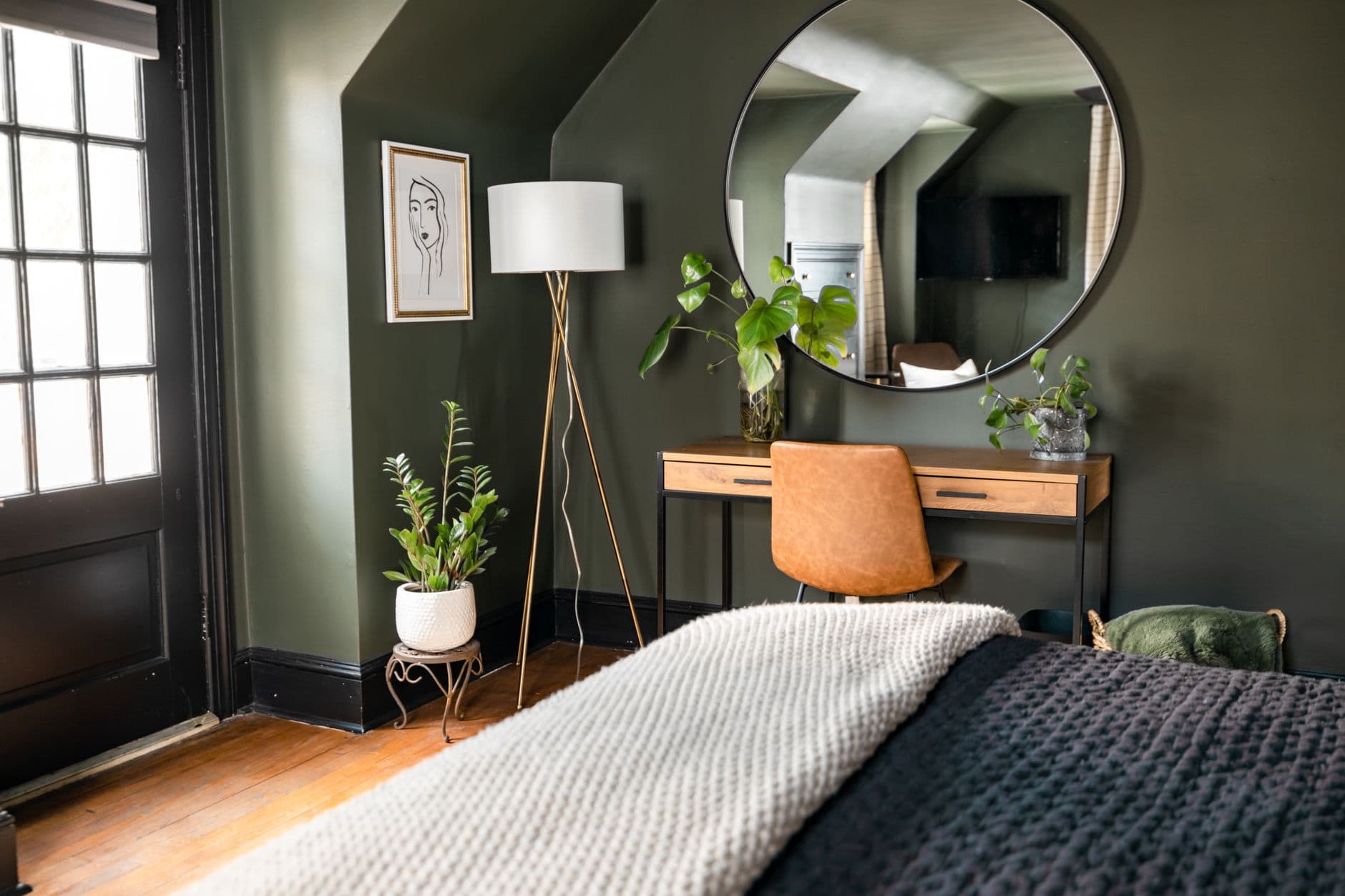
The quickest way to lose depth is to match every object to the same warm neutral swatch. Natural materials already bring undertones: oak can lean yellow, limestone can appear pink, and an off white can turn green beside a garden window. Collect samples from the actual suppliers and arrange them vertically as well as flat. Paint lives on the wall, not on a table. Check the group in the morning, at midday and after the lamps come on. Then add a controlled dark note. A brown stained frame, charcoal lamp or blackened metal shelf can outline the softer materials and stop the room drifting into one pale field. The dark element does not need to be repeated at equal intervals. Put it where the room needs definition, such as the edge of a doorway, the base of a table or the line of a fireplace. If the palette only works under one lamp setting, it is not ready. Good colour decisions continue to make sense when the weather and season change.
Use curves where a body or route needs them
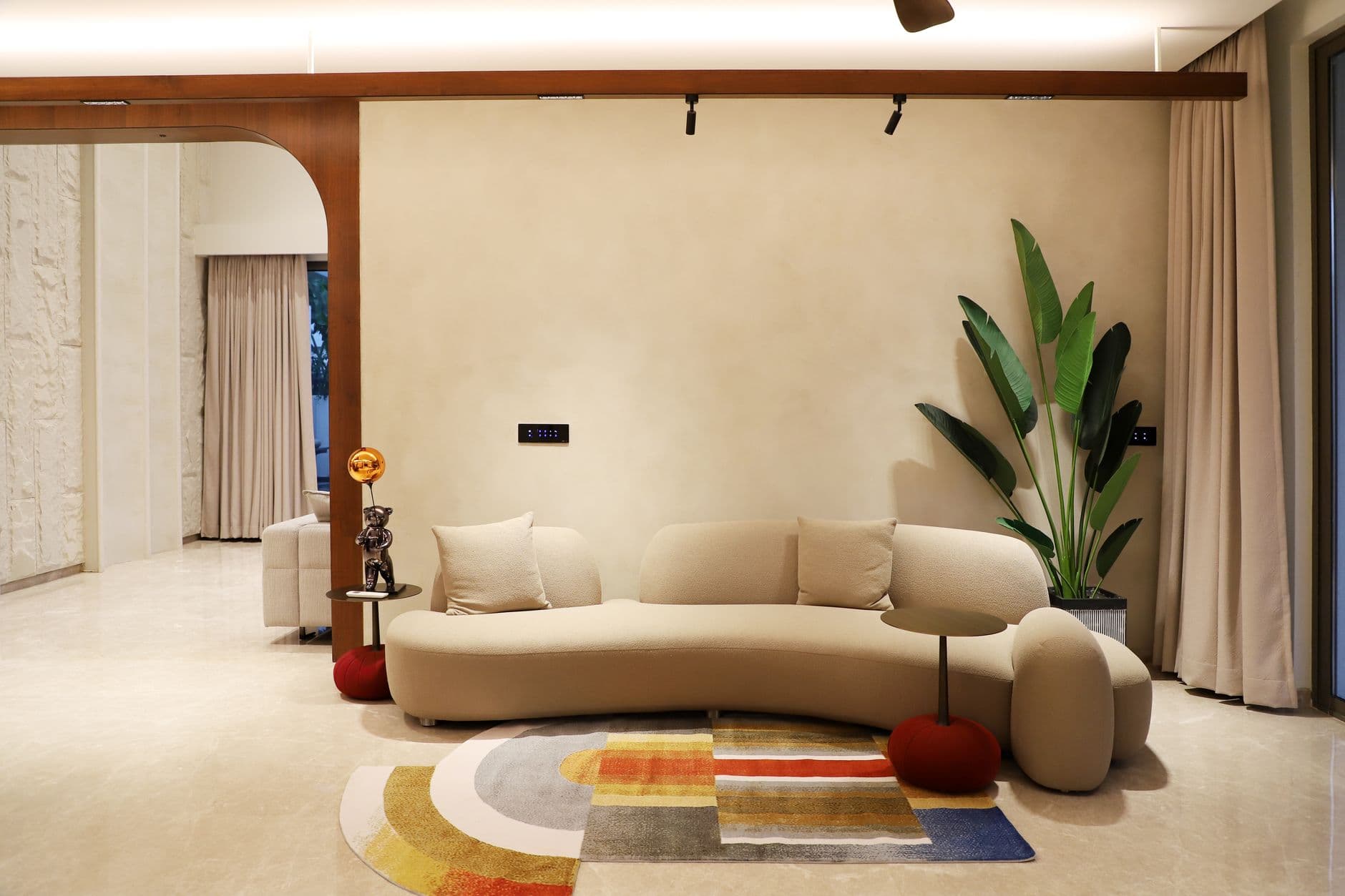
A curve is useful when it changes how a room works. A rounded table corner leaves more room beside a narrow passage. A bowed sofa can turn seats toward one another. A circular rug can gather chairs that would look stranded on a long rectangle. Begin with that practical effect, not with the idea that every hard line needs softening. Too many unrelated arcs create the same noise as too many colours. Mark the full footprint on the floor with paper or tape, including the deepest point of the curve. Catalogue dimensions often describe only maximum width and depth, which can hide how much usable seating or table surface remains. For dining furniture, pull every chair out as it would be during a meal and walk behind it. For a sofa, check whether the curve leaves awkward wedges against a straight wall. A rounded object deserves its space when it improves movement, conversation or comfort. Otherwise, a clear rectangular form will usually use the floor more efficiently and sit more calmly with the architecture.
Treat wall finish as construction, not decoration

Limewash, mineral paint and polished plaster can make a plain wall respond beautifully to daylight, but the names do not tell you how a specific product should be installed. The substrate, primer, number of coats and hand of the applicator all affect the result. Ask the manufacturer what the wall needs, how patches are repaired and whether a high traffic area can be cleaned without leaving a larger mark. Make a sample board instead of painting a small square on the finished wall. You can move the board through the room and compare it with flooring, curtains and evening light. If emissions or environmental claims influence the choice, look for documentation tied to the exact product. The EU Ecolabel criteria for indoor and outdoor paints and varnishes cover limits on hazardous substances and volatile organic compounds as well as performance requirements, but not every matte or mineral finish carries that label. Keep the product name, colour code, batch and application notes. A nuanced wall is easier to live with when the repair process is not a mystery.
Edit the room by jobs, not object count
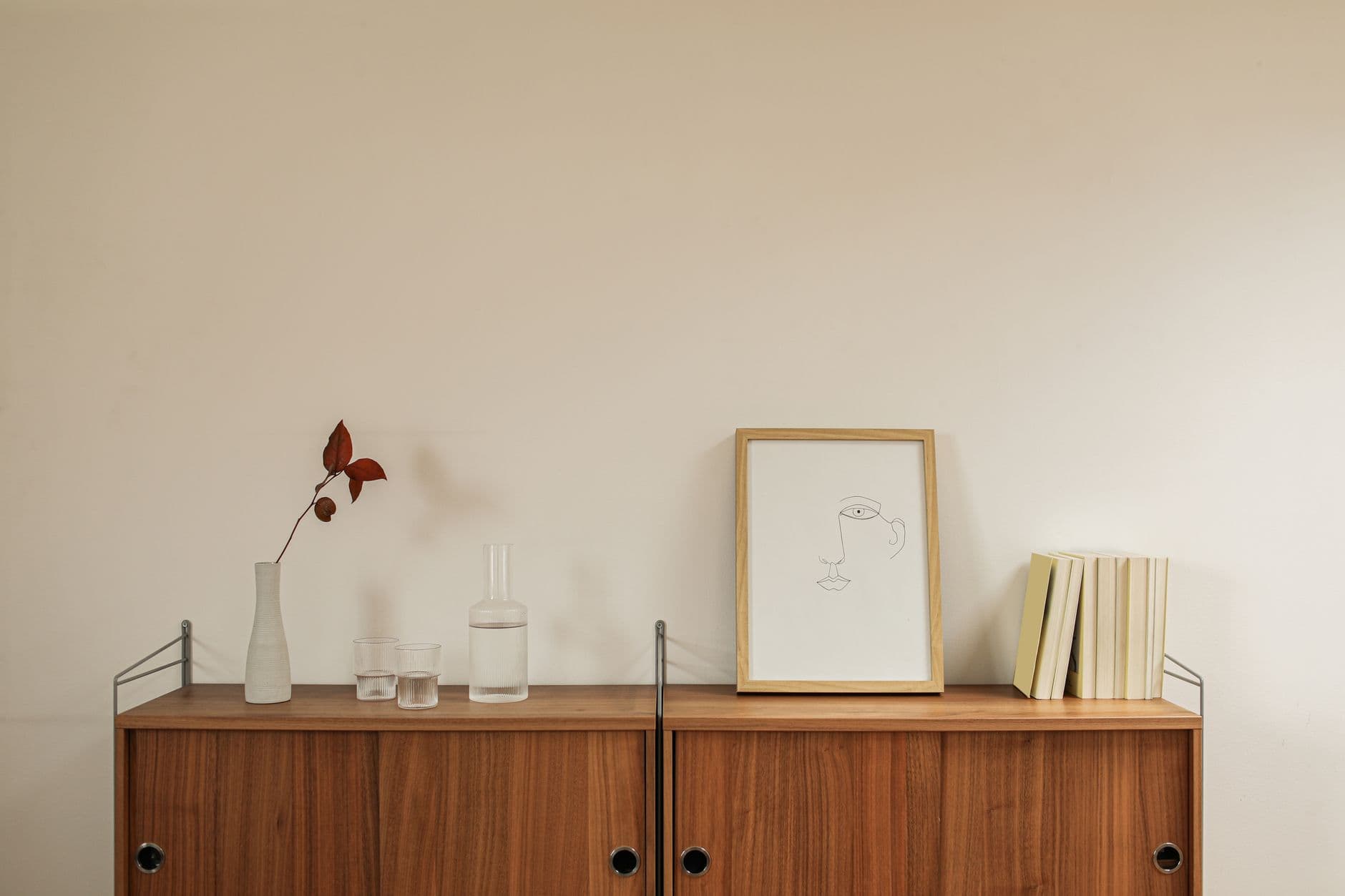
Minimalism becomes uncomfortable when removing objects is treated as the goal. A room still needs a place to set down a glass, a lamp that reaches the page, closed storage for practical clutter and enough fabric to control echo. Write those jobs down before deciding what should leave. One side table might serve two seats, but only if both people can reach it. A bench may provide a clean line and still be a poor substitute for a chair used every evening. Empty floor matters too. It protects the route between doors, gives a cupboard room to open and lets daylight reach farther into the plan. Photograph the room from its entrances and remove one interruption at a time. Live with each change for several days instead of clearing everything in one afternoon. The useful edit often adds something specific, such as a reading light or a shallow drawer, while removing three temporary fixes. The final room should make ordinary actions easier. Visual calm follows when objects have a reason to be there and a place to return to.